Last week, I was in Washington, D.C. for ASAE’s 2014 Marketing, Membership & Communications Conference, where I picked up practical tips on how to create marketing materials that rock and communicate visually.
In a highly-interactive session titled, “Make Your Membership Marketing Materials Rock,” Elizabeth Engel, CEO and Chief Strategist at Spark Consulting, shared 10 tips and examples for creating better marketing materials. A few of my favorites:
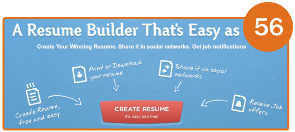
Have a clear call to action. A great resource she shared for this is Hubspot’s “101 Examples of Effective Calls-to-Action.” It’s important to determine the focus and message of your marketing, to make sure it’s communicated clearly and includes an action to take. Here’s a great example:

Use color. It’s amazing how color can influence our mood and actions. Experiment with colors when creating your next marketing project. Highlight your call-to-action button in two different colors, and see which one has a higher click-through rate. Use color to emphasize specific content that your readers don’t want to miss. For additional insights, check out this post.

Use image heatmapping. Heatmaps allow you to look through the eyes of your visitors as they navigate your website. Did you know that people look at websites in an “F” pattern? To capture your visitor’s attention and gain more clicks, consider shifting your content around the “F”. For heatmap resources, check out this post.

After sharing her tips, Engel encouraged us to form groups and, using our newly acquired insights, assess marketing materials submitted by various associations attending the conference. My group saw a lot of marketing samples, including brochures, business cards and print and online promotions, and recognized a few common trends (good and not-so-good):
What are some tips you’ve gathered from ASAE’s MM&C Conferences? Let us know in the comments below, or leave us a comment on Facebook! To learn how ACGI Software’s integrated marketing and communication solutions for associations can enhance your marketing programs, catch us at ASAE’s Annual Conference in Nashville, TN, August 9-12, or simply click here to join us for an upcoming overview webinar!
Photo Sources: Hubspot, The Logo Company, nngroup